
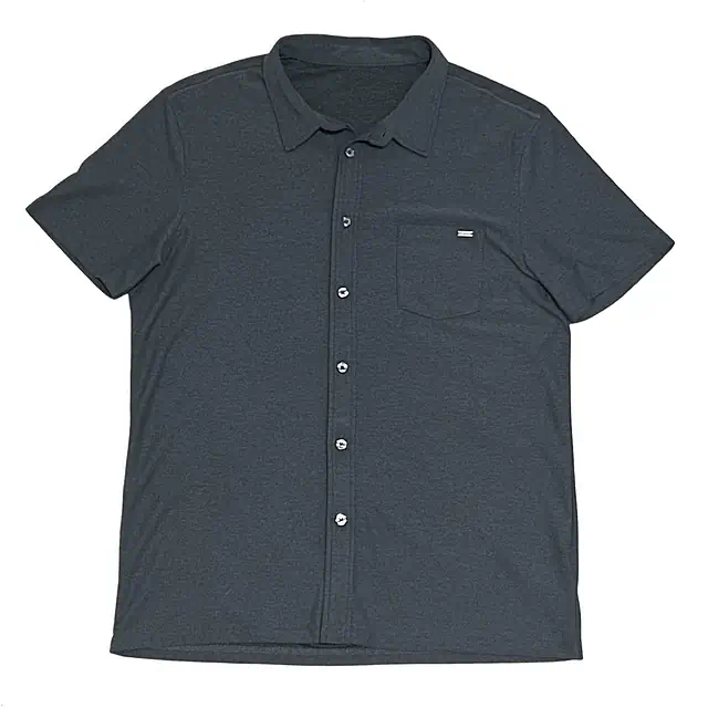
The transparent-vs-white question is not really about which background looks nicer. It is about where the product photo goes after cleanup. A white-background image is usually a publishing asset. A transparent image is usually a reusable master asset. Treating them like the same thing is how catalog workflows get weird.
If you sell on one storefront with a white product grid, a clean white image may be all you need. If the same image feeds marketplaces, ads, banners, email, social posts, a design team, and a future site redesign, transparent starts to look less like a fancy option and more like insurance.
This article is about product-photo output decisions, not the mechanics of alpha channels. For the lower-level API details, see the transparent PNG guide. Here we care about catalog consistency, marketplace readiness, file size, shadows, edge quality, and not painting yourself into a very white corner.
01
The short answer
If the image is going directly to a marketplace or a white storefront grid, use a white-background derivative. If the image needs to be reused across multiple layouts, keep a transparent master. If you are building a real product-photo pipeline, create both.
Best as a final catalog asset
White backgrounds are predictable, easy to compress, and safe for most product listing pages. They are also destructive: once the background and shadow are baked in, changing the context later means reprocessing or accepting a compromise.
Best as a reusable master
Transparent cutouts are flexible. They can become white product images, card images, ad assets, or thumbnails. But they need careful edges, viewer support, and intentional downstream flattening.
Decision matrix
Choose white when:
  - the image is going straight to a marketplace
  - your storefront grid uses a white or very light background
  - you want smaller JPEG or WebP files
  - the product needs a natural shadow baked into the asset

Choose transparent when:
  - the image will be reused in ads, banners, or design tools
  - the same product appears on multiple backgrounds
  - your storefront uses cards, gradients, dark mode, or seasonal themes
  - another system will composite the product later

Create both when:
  - products are reused across several channels
  - you need a master asset plus channel-specific derivatives
  - you are building a cleanup pipeline instead of editing one image
02
When white backgrounds win
White is the safe choice when the image is already near its final destination. Product listing pages, marketplace feeds, shopping ads, invoices, reseller portals, and CSV exports all tend to prefer boring image files that render the same everywhere. Boring is underrated when there are 80,000 SKUs involved.
A white JPEG or white WebP also avoids a bunch of alpha-channel problems. Some systems flatten transparent images onto black. Some strip alpha during optimization. Some create thumbnails against a default matte you did not choose. With a white derivative, the background is already decided, so those systems have fewer opportunities to be creative in the bad way.
Consistency
A white canvas makes grid pages easier to scan. Products appear to live in the same visual system even when the source photos came from different suppliers.
Compression
Flattened JPEG or WebP files are often much smaller than transparent PNGs. That matters for storefront pages with dozens of product cards.
Compatibility
White-background files work in older tools, feed processors, email builders, spreadsheets, and marketplaces that do not care about your elegant alpha channel.
The tradeoff is that white is not neutral forever. A white-background image looks clean on a white page, but awkward on a tinted card, dark theme, seasonal campaign, or hero layout. It also bakes shadows and edge decisions into the file. If you later want the product on a pale gray card, you may discover that the old white matte is still sitting there, smugly rectangular.
03
When transparent wins
Transparent product images are strongest when the product needs to move around. A transparent master can be placed on a white catalog canvas today, a gray card tomorrow, and a promotional banner next month. It gives downstream systems room to compose instead of starting from a flattened image.
That flexibility is why transparent output is valuable for internal asset libraries. Designers, marketplace operations teams, ad pipelines, and merchandising tools can all derive their own channel assets from the same cutout. The transparent file is not always what you publish, but it is often what you want to keep.
A transparent PNG is a master asset, not automatically the best storefront asset. The useful pattern is usually: original source -> transparent master -> channel derivatives.
The downsides are real. Transparent PNGs can be larger. Bad edge color is more visible when the background changes. Natural shadows are harder to preserve in a way that works everywhere. And if a downstream tool mishandles alpha, your beautiful cutout can become a product floating on black, which is rarely the brand moment anyone requested.
04
Why teams often need both
The cleanest production answer is usually not "transparent or white." It is "transparent first, white where needed." Keep the original upload, keep a transparent master, and generate white or card-specific derivatives from that master. Now the catalog team gets stable assets and the creative team gets reusable assets. Everybody gets to be only mildly annoyed.
Storage layout
products/sku_123/source/original.jpg
products/sku_123/master/transparent.png
products/sku_123/publish/white-2000.jpg
products/sku_123/publish/card-1200.webp
products/sku_123/publish/thumb-400.webp
products/sku_123/review/edge-check.png
This structure also makes reprocessing less painful. If a marketplace changes its image requirements, or your store redesign moves product cards from white to light gray, you can regenerate derivatives from the transparent master instead of asking every supplier for new photos. Future-you deserves that small mercy.
05
Canvas and product size matter as much as background
Background choice will not fix a chaotic catalog if every product is a different size in frame. A tight transparent crop can make a ring look enormous and a sofa look tiny. A white canvas can still look messy if the product jumps around from card to card. The background is only one part of the asset standard.
Decide the canvas, margin, and product footprint before you process thousands of images. For product grids, the usual goal is not the tightest possible crop. The goal is that similar products appear at similar visual scale. That means defining padding, maximum product bounds, and whether the product is centered or anchored.
Canvas rules
canvas:
  width: 2000
  height: 2000
  background: "#ffffff"

product:
  fit: contain
  max_width: 84%
  max_height: 84%
  anchor: center

review:
  flag_if_product_touches_edge: true
  flag_if_subject_area_below: 18%
  flag_if_subject_area_above: 88%
White-background outputs usually include a fixed canvas because the white space is part of the final file. Transparent masters can be stored either with the source canvas or with a normalized canvas. Just pick intentionally. A random mix of tight crops and padded canvases is the kind of thing that looks harmless in storage and terrible on a product grid.
06
Edges, shadows, and halos
White backgrounds can hide small edge mistakes. Transparent backgrounds expose them. That is not a reason to avoid transparency, but it is a reason to test the same cutout on white, gray, and dark backgrounds before trusting it as a reusable asset.
Watch for matte color around the product. If the original was shot on beige paper, the edge pixels may carry a beige fringe. Flattening onto white can make that fringe harder to notice. Placing the same transparent PNG on a dark campaign card makes it obvious. The transparent file is more honest, which is sometimes inconvenient.
Review signals
Send to review when:
  - a white product disappears on a white background
  - transparent glass, handles, holes, spokes, or straps look wrong
  - the product has a natural shadow that should not be cut away
  - edges look fine on white but dirty on a dark checkerboard
  - the product appears much larger or smaller than similar SKUs
  - the output has unexpected empty space or clipped details
Shadows need their own decision. A soft natural shadow can make a product feel grounded on white. The same shadow on transparent can look strange when composited onto a patterned or dark background. For a serious pipeline, treat "transparent no-shadow master" and "white image with natural shadow" as different output recipes.
07
Formats and storage
Transparent usually means PNG when you want broad compatibility and clean alpha. WebP can also carry transparency and can be smaller, but PNG remains a safe master format in many catalog systems. White backgrounds can be JPEG or WebP because they do not need alpha.
Transparent master
Use PNG with RGBA when you care about predictable alpha and downstream editing. Store it as a source for derivatives, not necessarily as the file every customer loads.
White catalog image
Use JPEG or WebP when the background is fixed. This usually gives smaller files and fewer compatibility surprises.
Thumbnail
Use WebP when your delivery stack supports it. Generate it from the chosen publishing asset so thumbnails match the product grid.
Do not overwrite the original product photo with either derivative. The original is your reprocessing source. The transparent master is your compositing source. The white image is your publishing asset. Those are three different jobs, even when they come from one upload.
08
A practical output workflow
In a product cleanup pipeline, ask BackgroundErase for the transparent master first. Then generate channel-specific assets from that master: white marketplace image, card background, thumbnail, ad cutout, or whatever else your catalog needs.
Output recipes
transparent-master:
  format=png
  channels=rgba
  crop=false

marketplace-white:
  format=jpg
  bg_color=#ffffff
  crop=true

storefront-card:
  format=webp
  bg_color=#f7f7f4
  crop=true

design-cutout:
  format=png
  channels=rgba
  crop=true
If you need exact canvas control, do that in your own derivative step after background removal. The API removes the background. Your catalog renderer decides the final canvas, padding, file format, and background color for each channel.
Generate a white derivative
import sharp from "sharp";

export async function makeWhiteDerivative(transparentPng) {
  return sharp(transparentPng)
    .resize({
      width: 2000,
      height: 2000,
      fit: "contain",
      background: "#ffffff",
    })
    .flatten({ background: "#ffffff" })
    .jpeg({ quality: 92, mozjpeg: true })
    .toBuffer();
}
Pipeline shape
async function processProductImage(source, sku) {
  const transparent = await removeBackground(source, {
    format: "png",
    channels: "rgba",
    crop: false,
  });

  await store(`products/${sku}/master/transparent.png`, transparent, {
    contentType: "image/png",
  });

  const white = await makeWhiteDerivative(transparent);

  await store(`products/${sku}/publish/white-2000.jpg`, white, {
    contentType: "image/jpeg",
  });
}
09
Decision checklist
The decision is less philosophical once you map it to channels. Do not ask "which background is best?" Ask "which asset does this destination need, and what should we keep so we can make new assets later?"
Use white only
Good for a small catalog, one primary storefront, no design reuse, and no expectation that the background will change later.
Use transparent only
Good for internal creative libraries, design tools, or systems that always composite images before publishing.
Use both
Best for most serious ecommerce workflows: keep transparent as the master, publish white or channel-specific derivatives.
White is the asset you publish. Transparent is the asset you build from.
That is not a universal law, but it is the cleanest default. Store the original, keep the transparent master, and generate the white version your storefront or marketplace needs. The extra derivative is cheaper than discovering later that every product image is trapped on the wrong background.
Read the product cleanup workflow